What to check when choosing
Start with the colour space used for the interface, then check whether the screen can be positioned at both desk heights. Treat contrast and colour-only signals as checks on the content, not specifications a monitor can satisfy for it.
| Concern |
What to check |
Who this matters to |
| Colour and contrast review |
Check for a stated sRGB mode or coverage and exact-model colour information. Plan a colour-managed workflow if decisions need to be repeatable. |
If I review web colours regularly, I need a controlled display setup without mistaking a vivid image for an accessible interface. Around 42% of consumers put reliable colour and contrast assessment first. |
| Sit-stand positioning |
Check the available height and angle adjustment at both desk positions; for an arm, confirm the desk mount and monitor fit. |
When I raise my desk, I want to move the screen back towards a workable eye level rather than keep the seated position. Roughly 33% of consumers prioritise repeatable positioning. |
| Glare and non-colour cues |
Check screen placement against room lighting and viewing distance. Test the interface’s contrast values, labels and other cues separately. |
If reflections obscure controls or a status change appears only as a new colour, I could miss a problem during review. Around 25% of consumers put glare control and non-colour cues first. |
Joybuy monitor choices
These desktop monitors are relevant to colour review at a standing desk. Compare their stated screen formats, then check each model’s sRGB settings, connection options and positioning range against your own setup.
 No image available
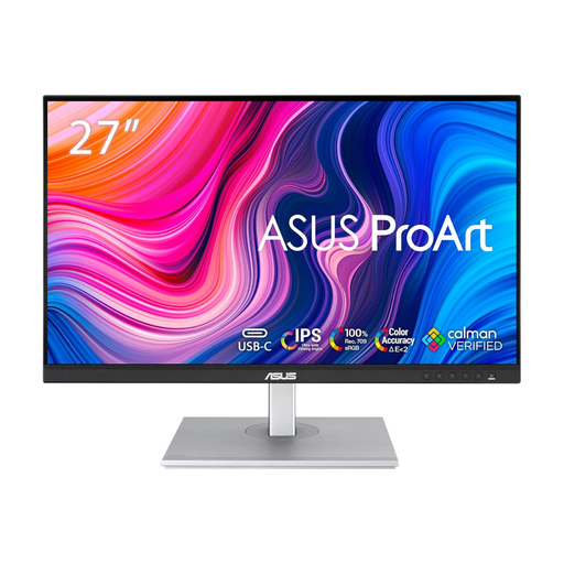
ASUS ProArt PA278CV IPS WQHD monitor
Consider this IPS WQHD model if you need to review web colours and reposition the screen as desk height changes. Confirm the available sRGB mode, stand travel and connection options for your setup; test accessibility in the interface itself.
View on Joybuy
 No image available
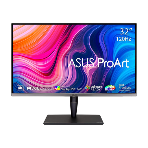
ASUS ProArt Display PA32UCG-K 32-inch 4K HDR IPS Mini LED monitor
The 32-inch 4K display may suit a workspace with room for a larger screen. Check its sRGB workflow, stand movement and viewing distance before choosing it for standing-desk review; its HDR and wide-colour features do not establish accessible contrast in web content.
View on Joybuy
 No image available
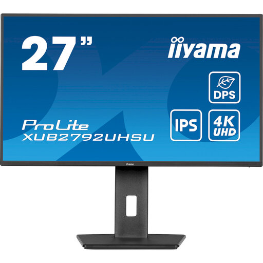
iiyama ProLite XUB2792UHSU-B6 27-inch 4K UHD monitor
Consider this 27-inch 4K UHD model if its screen size fits your viewing distance. Check its colour mode and the stand’s movement at seated and standing heights; for repeatable colour-critical work, confirm the model’s accuracy information and plan how you will profile the display.
View on Joybuy
 No image available
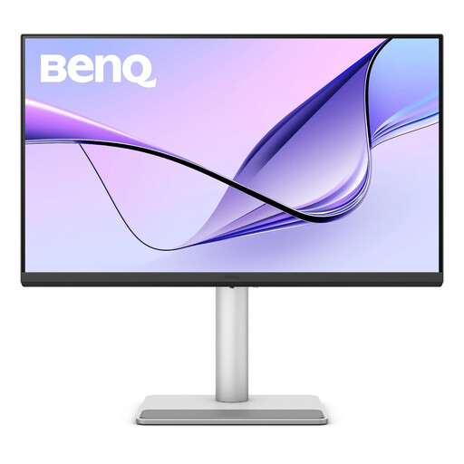
BenQ MA270UP 27-inch Nano Glossy IPS 4K UHD Mac monitor
This 27-inch model has a height-adjustable stand and may be relevant to a Mac-based desk setup. Check compatibility with your computer and colour workflow, and assess whether its Nano Glossy surface creates distracting reflections under your room lighting.
View on Joybuy
 No image available
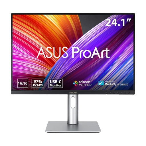
ASUS ProArt PA248CRV IPS WUXGA monitor
Consider this IPS WUXGA model if that format suits your desktop layout. Before using it for web-colour decisions, confirm its sRGB mode, colour-accuracy information and stand adjustment for both desk heights; factory-oriented wording alone cannot replace checks on your installed display.
View on Joybuy
Questions about colour checks and positioning
Can a colour-accurate monitor prove that a page meets WCAG contrast requirements?
No. Contrast is a property of the content being checked, not a result established by the monitor’s specifications. Under WCAG 2.2, the W3C Web Accessibility Initiative specifies at least 4.5:1 for normal text under Success Criterion 1.4.3, subject to its exceptions, including a 3:1 threshold for large-scale text; meaningful non-text components and graphics have a 3:1 requirement under Success Criterion 1.4.11.
Do accessible colour checks need more than different hues?
Yes. The W3C Web Accessibility Initiative’s Success Criterion 1.4.1 says colour must not be the only visual means of conveying information, indicating an action, prompting a response or distinguishing an element. Inspect labels, text, icons or patterns as well as the colour difference.
How should I position a monitor when switching between sitting and standing?
Adjust it at each desk height so the top of the screen is at or slightly below eye level, following Ergotron’s positioning guidance. Check that the stand or arm has enough movement and that screen placement and tilt help manage glare in both positions.
When is monitor calibration worth considering for accessibility review?
Calibration is particularly relevant when colour decisions must remain repeatable across displays or a wider camera-to-print workflow. Calibrite describes profiling as a way to manage variation between devices, but calibration still does not replace checking the interface’s contrast ratios and non-colour cues.


