For routine web and app reviews, choose a monitor with an appropriate sRGB workflow and documented colour settings; consider hardware calibration or an integrated sensor when repeated colour-critical reviews call for more consistent settings. A monitor cannot establish accessibility on its own: check contrast with a tool, review information conveyed by colour and include manual evaluation.
Who is this for?
Web and product designers reviewing interface colours
An sRGB-oriented workflow helps you inspect interface colours consistently, but visual judgement is only part of the task. The W3C Web Accessibility Initiative also calls for sufficient text contrast and says colour must not be the sole way to convey information.
Teams conducting repeated colour reviews
If designs are reviewed regularly or at a shared workstation, consider how the display will be recalibrated. BenQ documents hardware calibration for the SW272U, while EIZO documents scheduled calibration using the CG2700S’s built-in sensor.
Accessibility leads checking more than colour
A monitor supports visual inspection, not an end-to-end accessibility assessment. The W3C Web Accessibility Initiative says knowledgeable human evaluation is needed alongside tools to determine whether a site is accessible.
What matters when choosing?
Start with the colour workflow used for interface review, then decide whether repeated work calls for recalibration. Check desk connections separately: they make the setup more convenient but do not determine accessibility.
| Concern | What to check | Who this matters to |
|---|
| On-screen colour and contrast |
Check the exact model’s sRGB mode or documented coverage and its stated calibration starting point. Use a contrast tool to assess text. |
When reviewing web interfaces, I need to see colours in an appropriate mode without treating what looks readable as a measured result. Around 31% of consumers put this visual-review need first. |
| Repeatable calibration |
Check for hardware calibration or an integrated sensor, and what is needed to recalibrate during ongoing use. |
For recurring colour-critical reviews, I need a way to maintain consistent display settings rather than relying only on factory calibration. This is the primary concern for around 38% of consumers. |
| Accessibility beyond appearance |
Plan for contrast checks, inspection of non-colour cues and manual evaluation as well as visual review. |
If I am assessing whether people can use a service, a convincing image on screen cannot answer every accessibility question. Around 23% of consumers prioritise the wider testing workflow. |
| Desk and laptop setup |
Check the required video connection, laptop compatibility and stand adjustment for your workspace. |
When moving between a laptop and design-review windows, I want a desk arrangement that fits how I work. Around 8% of consumers make setup convenience their primary concern. |
Mistakes to avoid
-
Assuming wider gamut improves ordinary web-colour checks
Adobe RGB or P3 coverage can matter in creative workflows, but it does not establish that sRGB-oriented interface colours are being shown in the intended mode.
For web or app review, confirm the monitor’s sRGB setting or the colour-managed workflow used by your software.
-
Treating factory calibration as a permanent setting
A factory-calibration claim describes a starting point, not an ongoing recalibration process.
Match the calibration approach to how often colour-critical reviews are repeated; check whether the monitor supports hardware calibration or has an integrated sensor.
Ongoing recalibration may require a separate calibration device or service.
-
Using the screen or a contrast checker as the entire test
The W3C Web Accessibility Initiative says no tool alone can determine whether a site meets accessibility standards.
Use tools to identify issues, then carry out manual checks and knowledgeable evaluation of the relevant journeys.
-
Checking contrast but relying on colour alone for meaning
Passing a text-contrast check does not address the separate W3C requirement that colour must not be the only visual means of conveying information.
Check statuses, errors, charts and links for suitable labels, text, icons, patterns or other non-colour distinctions.
Relevant brands to consider
EIZO
The ColorEdge CG2700S is a route for teams planning regular calibration at a shared or colour-critical review station.
- EIZO documents a built-in sensor that can calibrate the CG2700S automatically at scheduled times.
- Its specialist calibration approach may be more than occasional contrast checking requires; that task still needs accessibility tools.
BenQ
The PhotoVue SW272U combines an sRGB workflow with features for broader creative colour work.
- BenQ specifies 100% sRGB and Rec.709 coverage, 99% Adobe RGB and P3 coverage, hardware calibration and a 16-bit 3D LUT for the SW272U.
- These manufacturer specifications help distinguish workflows; they do not certify that an interface is accessible.
ASUS
The ProArt PA279CRV is a 27-inch 4K model for design work where a documented factory-calibrated starting point matters.
- ASUS describes the PA279CRV as Calman Verified and factory pre-calibrated to Delta E < 2, with 99% DCI-P3 and Adobe RGB coverage.
- For ordinary web-colour review, confirm the active sRGB or colour-managed workflow rather than relying on wide-gamut coverage alone.
Dell
The UltraSharp U2723QE is a general-purpose 4K USB-C model with documented sRGB coverage.
- Dell’s UK product information lists 100% sRGB and 98% DCI-P3 coverage for the U2723QE.
- Dell marks this exact model unavailable on its UK product page; check current availability before considering it for purchase.
Joybuy monitor choices
These monitors cover desk-based interface review and, in one case, a hardware-calibration route. Choose according to the colour workflow and review frequency you need; none replaces accessibility testing.
 No image available
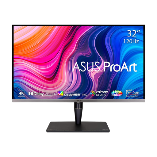
ASUS ProArt Display PA32UCG-K, 32-inch 4K
Consider this model if hardware calibration is part of your recurring colour-review workflow.
The product name specifies an IPS Mini LED display, hardware calibration and Thunderbolt 3. Confirm the sRGB mode and software setup you intend to use for interface review.
View on Joybuy
 No image available
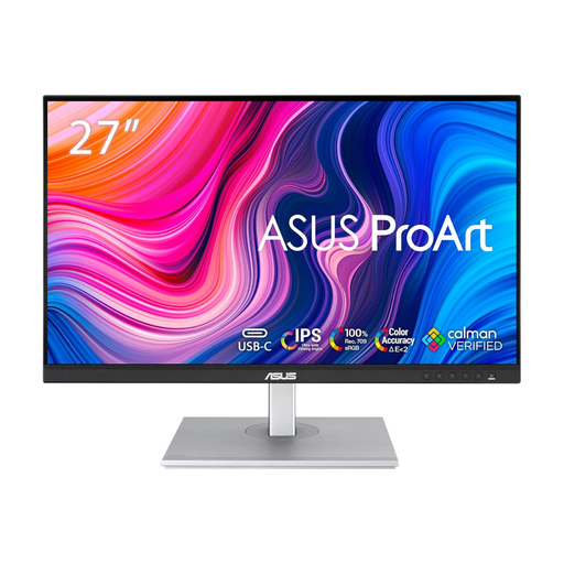
ASUS ProArt PA278CV IPS WQHD
Consider this model for desk-based interface review if its WQHD workspace suits the windows and tools you use.
Check its colour-mode settings and how you would maintain calibration if reviews are repeated over time.
View on Joybuy
 No image available
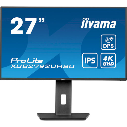
iiyama ProLite XUB2792UHSU-B6, 27-inch 4K UHD
Consider this 4K desk monitor if workspace detail matters alongside interface-colour review.
Before using it for repeated colour-critical decisions, confirm the available sRGB mode and calibration arrangements.
View on Joybuy
 No image available
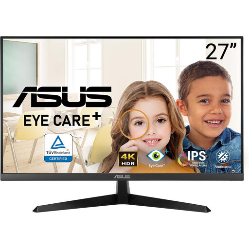
ASUS Eye Care VY27UQ, 4K UHD 60 Hz
Consider this 4K model for visual interface review if its colour settings suit your software workflow.
If consistent results across repeated reviews matter, check its calibration options before choosing it for that role.
View on Joybuy
Common questions
Can a colour-accurate monitor prove that my website meets WCAG?
No. A stable display can support visual review, but the W3C Web Accessibility Initiative says no tool alone can determine whether a site meets accessibility standards. Include knowledgeable human evaluation of matters such as keyboard use, labels and focus behaviour.
What text contrast should I check?
Under WCAG 2.2 Success Criterion 1.4.3, normal text and images of text need a contrast ratio of at least 4.5:1; large-scale text has a 3:1 minimum, subject to the criterion’s exceptions. Use a contrast checker rather than judging the ratio by eye.
Is sufficient contrast enough when statuses use different colours?
No. WCAG Success Criterion 1.4.1 says colour must not be the only visual means of conveying information or distinguishing an element. Where colour carries meaning, check for an accompanying label, icon, pattern or other non-colour cue.


