Choose a monitor with a suitable colour mode, documented accuracy or calibration support, an adjustable stand and a screen surface that helps manage reflections. Brightness alone will not fix window glare: position the screen to avoid direct reflections and use blinds or curtains where needed. Check the finished interface with a contrast-ratio tool rather than judging accessibility by how vivid its colours look.
Who this is for
Accessibility-focused interface designers
If you review text, controls, charts and status colours, a repeatable colour mode helps you inspect designs consistently. Verify the actual foreground and background contrast separately; as the W3C Web Accessibility Initiative explains, vivid hues alone do not establish legibility.
Colour-critical creative professionals by a bright window
If you edit visual assets or approve colour near strong daylight, consider the screen surface, adjustment range and calibration workflow together. The Health and Safety Executive advises arranging the desk and screen to avoid glare or bright reflections.
Laptop users building a one-cable design desk
If the monitor will also connect and charge your laptop, check the exact video connection, power-delivery requirements and stand adjustment. Docking convenience does not establish that a display meets your colour-review needs.
What to check when choosing
Start with the colour and contrast checks your work requires, then make sure reflections can be controlled at the desk. Compare production-colour and connection features against the tasks you actually do.
| Concern | What to check | Who this matters to |
|---|
| Accessible colour and contrast |
Check for a colour mode suited to the delivery space, such as sRGB for relevant web work, and a way to verify the finished interface with a contrast-ratio tool. |
If I review text and meaningful UI elements, I need to test their actual colours rather than trust a vivid screen. Around 36% of consumers would put reliable accessibility checks first. |
| Window reflections |
Check the screen surface and whether its stand or mount lets you reposition it; assess the window angle and available blinds or curtains too. |
Daylight reflected across my screen makes close inspection difficult even if I turn up the brightness. For roughly 29% of consumers, controlling glare would take priority. |
| Repeatable production colour |
Compare documented accuracy for the exact model and colour space, then check what calibration equipment or software your approval workflow requires. |
When I approve visual assets, I need a colour setup I can maintain as room lighting changes. About 21% of consumers would make repeatable colour their primary concern. |
| Laptop and desk fit |
Confirm that your laptop and cable support the monitor’s video connection and required charging power, and that the stand fits your desk. |
I want a dependable laptop connection without giving up a useful screen position beside the window. One-cable desk integration would come first for around 14% of consumers. |
Buying pitfalls
-
Choosing by peak HDR brightness alone
Peak HDR brightness does not tell you how the screen handles reflections or whether its colour settings suit your work. Direct window reflections can remain distracting on a bright display.
Compare the exact model’s typical brightness, surface treatment and adjustment range, then check whether changing the screen position or window covering addresses the glare.
-
Treating vivid colour as an accessibility test
The W3C Web Accessibility Initiative assesses text contrast using relative luminance between foreground and background colours. A saturated display mode cannot establish that an interface meets a contrast requirement.
Use a colour mode suited to the design’s delivery space and test the actual colour pairs with a contrast-ratio tool.
-
Assuming factory calibration remains accurate indefinitely
A factory setting is a starting point, not a permanent measure of current colour accuracy. Datacolor’s calibration guidance notes that significant changes in room light can call for recalibration.
For colour approvals, keep lighting and brightness targets consistent and plan how you will check calibration over time.
A compatible calibration device and any required software add to the setup; LG says its Calibration Studio software is not included with the 27UP850K-W.
Brands for reference
ASUS ProArt
The PA279CRV is a 27-inch 4K example aimed at colour-managed creative work.
- ASUS specifies 99% DCI-P3 and 99% Adobe RGB coverage and factory calibration to ΔE < 2 for the PA279CRV.
- Those manufacturer specifications do not replace the correct working colour mode, ongoing calibration or control of window reflections.
BenQ DesignVue
The PD3225U is a 31.5-inch 4K option for designers who want a larger working area.
- BenQ specifies a matte screen, 400-nit typical brightness and 2000:1 native contrast for the PD3225U.
- A larger screen needs suitable desk space, and its brightness specification does not eliminate reflections.
Dell UltraSharp
The U2725QE is a 27-inch 4K model to consider when laptop connectivity and desk adjustment are important alongside design work.
- Dell describes the U2725QE with an anti-glare and anti-reflective screen treatment, ambient-light sensing and Thunderbolt hub functionality.
- Check that the exact model’s colour modes and calibration workflow meet your requirements before using it for final colour approval.
LG UltraFine
The 27UP850K-W is a 27-inch 4K IPS example with creator-oriented colour and connection features.
- LG specifies 95% DCI-P3 coverage, USB-C charging up to 90 W and hardware-calibration readiness for the 27UP850K-W.
- LG says Calibration Studio software is not included; check the equipment and software needed for your intended workflow.
Joybuy monitor choices
These monitors offer different screen sizes and resolutions for an accessible-colour checking desk. Confirm the colour workflow and reflection control you need for each model; a monitor alone cannot resolve direct window glare.
 No image available
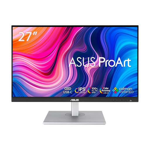
ASUS ProArt PA278CV IPS WQHD
Consider this model for an interface-design desk if WQHD resolution gives you enough working space. Check the colour mode used for your designs and position the screen to avoid direct window reflections.
View on Joybuy
 No image available
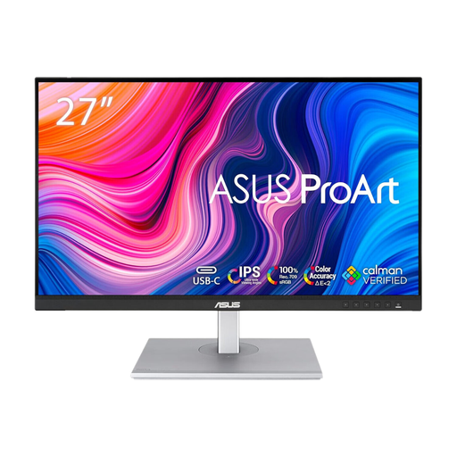
ASUS ProArt PA278CFRV IPS QHD 100Hz
This QHD model is worth considering if its resolution suits your design workspace. If laptop docking matters, confirm the exact unit’s USB-C connection and charging functions before buying.
View on Joybuy
 No image available
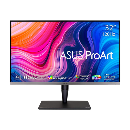
ASUS ProArt Display PA32UCG-K 32-inch 4K IPS Mini LED
The larger 4K screen may suit a desk with room for detailed layout work. Confirm its available colour presets and the brightness specification for the exact variant; do not treat an HDR peak figure as a solution to window reflections.
View on Joybuy
 No image available
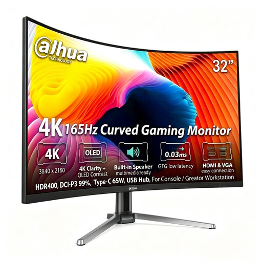
Dahua 32-inch 4K 165Hz Curved OLED Monitor
Consider the curved OLED format only if it suits your layout and viewing position. Its title specifies 99% DCI-P3 and Type-C 65 W; confirm the screen treatment, suitable colour modes and calibration workflow before relying on it for accessible-colour approval.
View on Joybuy
 No image available
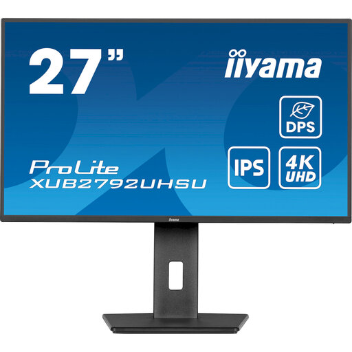
iiyama ProLite XUB2792UHSU-B6 27-inch 4K UHD
This model offers a 27-inch 4K workspace for inspecting interface layouts. Check its screen coating and colour-calibration options if reflections or final colour approval are central to your work; the title’s Matte Black description refers to the casing, not a confirmed screen finish.
View on Joybuy
Common questions
Will a brighter monitor solve colour checking beside a bright window?
No: extra brightness cannot remove a reflection across the screen or keep colour judgement consistent as daylight changes. The Health and Safety Executive advises arranging the desk and screen to avoid glare or bright reflections; adjust blinds or curtains where needed.
What contrast ratio should I check for normal-sized text?
For WCAG Success Criterion 1.4.3, the W3C Web Accessibility Initiative sets a minimum contrast ratio of 4.5:1 for normal text and images of text, and 3:1 for large-scale text. Test the foreground and background colours themselves, not the monitor’s brightness rating.
Do I need a calibrator if a monitor is factory calibrated?
Not for every casual workflow, but a factory calibration claim does not establish current accuracy indefinitely. If you repeatedly approve colour-critical work, plan a way to check and maintain calibration; Datacolor’s guidance notes that significant ambient-light changes can prompt recalibration.


