Choose the monitor around your artwork’s colour workflow: a calibrated sRGB mode is a practical starting point for work delivered online, while print-oriented, wide-gamut work calls for appropriate coverage and colour management. Then weigh the detail you need against calibration features, reflections and desk space; if the study must be especially quiet, check the exact unit’s noise and the seller’s return terms rather than assuming a model is silent.
Who is this for?
Print-conscious artists and retouchers
If you compare on-screen artwork with prints or work in Adobe RGB, prioritise a display you can calibrate and profile within your wider colour-managed workflow. A vivid-looking screen alone cannot establish a dependable print match.
Digital-first illustrators using a laptop desk
For artwork mainly viewed online, consider an appropriate sRGB mode alongside the resolution, connections and stand adjustments that fit your desk. Check laptop video and charging compatibility before counting on a single USB-C cable.
Study users bothered by reflections
If windows or lamps reflect in the screen, examine the exact model’s surface treatment and whether a hood is supplied or compatible. Canon’s colour-workflow guidance also notes that ambient light affects how you perceive colour.
What matters when choosing?
| Concern |
What to check |
Who this matters to |
| Colour management |
Match the display mode to your files and output. For print-oriented work, check wide-gamut coverage, calibration options and profiling support in your software. |
If I edit wide-gamut artwork for print, I need more than a screen that looks vivid: the image must pass through a managed workflow. Around 42% of consumers put colour-management confidence first. |
| Reflections and lighting |
Assess the screen surface, the position of windows and lamps, and whether a hood is supplied or compatible. Measure the footprint with a hood fitted. |
When light falls across my desk, reflections can get in the way of judging subtle artwork detail. For around 33% of consumers, controlling those reflections is the primary need. |
| Detail and desk setup |
Compare native resolution and stand adjustment with your viewing position. For a laptop, confirm USB-C video support and charging requirements. |
I want to inspect fine detail without making my study desk awkward to use or relying on a laptop connection that does not meet my needs. Around 25% of consumers prioritise this combination of detail and desk workflow. |
Mistakes to avoid
-
Choosing by gamut percentage alone
Adobe RGB or P3 coverage does not, by itself, tell you whether the image will be represented consistently through editing and output. The International Color Consortium explains that display calibration and profiling work together to support colour consistency.
Start with the colour space your files and destination use. For print-oriented work, confirm a compatible calibration and profiling workflow; for web-first work, check that the display offers a usable sRGB mode.
Print-oriented colour management may also require a colorimeter and time to set up and maintain the workflow.
-
Treating factory calibration as permanent accuracy
A maker’s Delta E specification describes its stated calibration conditions, not how every delivered unit will appear under your room lighting over time.
For colour-critical work, profile the unit you receive and recheck it periodically. If automated calibration matters to you, confirm what the exact model and its supported software can do.
-
Assuming USB-C will charge any laptop
A USB-C socket does not establish that the laptop can send video through it or that the monitor supplies enough power for that computer.
Check the laptop’s DisplayPort Alt Mode support and charging requirement against the exact monitor’s video and power-delivery specifications.
If the connection cannot meet both needs, you may have to keep using the laptop charger or a suitable separate connection.
-
Measuring only the visible screen
A hood or adjustable stand can change how much desk depth the setup needs. Changing ambient light can also affect colour perception, as Canon explains in its colour-calibration guidance.
Measure the intended viewing position and full monitor footprint, then consider how you will control nearby light and reflections.
Brands to consider
BenQ
The SW272U is BenQ’s 27-inch 4K route for colour-managed photography and artwork.
- BenQ specifies 99% Adobe RGB and P3 coverage, hardware calibration and a supplied shading hood for this model.
- Those specifications do not replace checking the delivered display’s profile in your own workflow; allow desk space for the hood.
EIZO
The ColorEdge CG2700S focuses on maintaining colour settings for photography, retouching and print work.
- EIZO specifies an integrated sensor and scheduled self-calibration for the CG2700S.
- Its recommended native resolution is 2560 × 1440, so choose it for its colour-management workflow rather than expecting 4K detail.
ASUS
The 27-inch 4K ProArt PA279CRV combines wide-gamut specifications with USB-C connectivity for a laptop desk.
- ASUS specifies 99% Adobe RGB and 99% DCI-P3 coverage, factory calibration and USB-C power delivery up to 96 W.
- For critical print work, check the delivered unit’s profile and your laptop’s video and charging requirements rather than relying on the factory or USB-C specifications alone.
Dell
The UltraSharp U2723QE is a 27-inch 4K option to examine for sRGB-oriented digital reference work and laptop connectivity.
- Dell specifies 100% sRGB coverage, an anti-glare coating and USB-C power delivery up to 90 W for the U2723QE.
- Dell UK lists this exact model as unavailable. Check any alternative model’s own specifications rather than assuming they carry over.
Joybuy monitors for reference artwork
These choices cover different approaches to artwork viewing, from larger 4K displays to WQHD and QHD desk setups. Compare each exact model with your colour workflow, available space and connection needs; none should be assumed quiet without assessing the unit.
 No image available
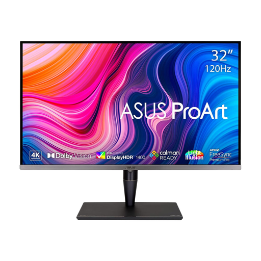
ASUS ProArt Display PA32UCG-K, 32-inch 4K IPS Mini LED
Consider this larger display if you want to inspect detailed artwork and have room for a 32-inch screen.
The product title specifies 4K resolution, hardware calibration and Thunderbolt 3. Confirm the calibration workflow and connection you need, and check the unit’s noise if silence is essential.
View on Joybuy
 No image available
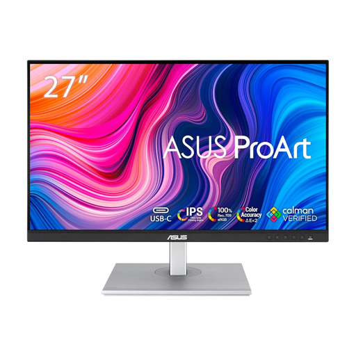
ASUS ProArt PA278CV IPS WQHD
This is a route to consider for screen-first reference work if WQHD provides enough detail for your viewing position.
The title identifies an IPS WQHD display. If you plan to connect a laptop over USB-C, check the exact video and charging specifications before purchase.
View on Joybuy
 No image available
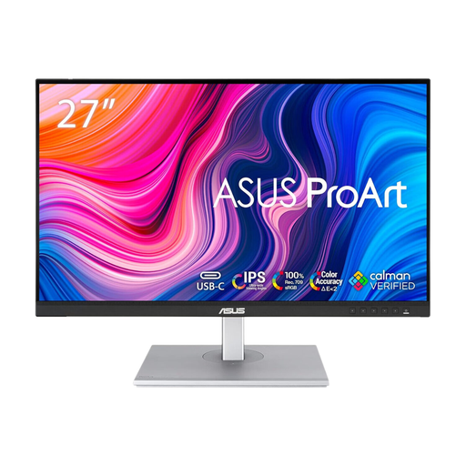
ASUS ProArt PA278CFRV IPS QHD 100 Hz
Consider this model for general digital artwork references if QHD detail suits your desk setup.
Its title specifies an IPS QHD display at 100 Hz. Confirm the exact port configuration if USB-C is important to your setup.
View on Joybuy
 No image available
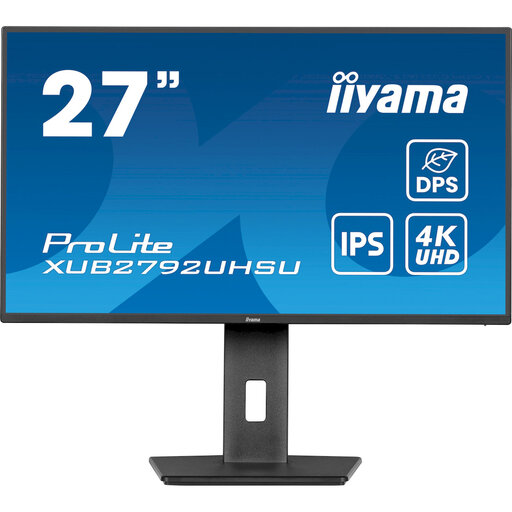
iiyama ProLite XUB2792UHSU-B6, 27-inch 4K UHD
Consider this 27-inch display if 4K image detail is a priority for digital reference artwork.
The title specifies 4K UHD resolution and a 16:9 format. Check calibration options, screen reflections and the connection required by your computer.
View on Joybuy
 No image available
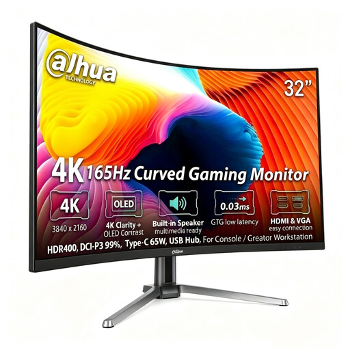
Dahua 32-inch curved 4K OLED monitor, 165 Hz
Consider this larger, curved display only if its shape and footprint suit the way you view reference artwork.
The title specifies 4K resolution, 99% DCI-P3 coverage and 65 W Type-C power delivery. Confirm your laptop’s requirements and the colour-management and reflection-control features your work needs.
View on Joybuy
Frequently asked questions
Do I need Adobe RGB to display reference artwork?
Not if your artwork is mainly created and delivered for online viewing in sRGB. Consider Adobe RGB-capable hardware when your files and print workflow use that wider colour space, and make sure your applications and display profiles are managed accordingly.
Is factory calibration enough to match a print?
Factory calibration alone does not establish a match with your own prints. The International Color Consortium describes calibration and profiling as complementary steps; print comparisons also call for an appropriate output profile and suitable viewing light.
How bright should the monitor be in my study?
Set brightness for the light in which you assess the artwork rather than relying on one setting for every room. Canon’s colour-calibration guidance notes that ambient light affects colour perception, so keep your viewing conditions as consistent as practical, especially when comparing screen and print.
Can I assume a monitor without speakers will be silent?
No; the absence of speakers is not a noise rating. If an exceptionally quiet study is essential, check the seller’s return terms and assess the exact unit in your usual working conditions.


