Daylight-facing type designers
If you inspect small text, spacing and layouts beside a window, reflections can interfere with the details you are trying to judge. Screen placement and surface treatment deserve attention before secondary features.


For close inspection of small type beside a bright window, start with a matt or anti-glare surface and a screen position that avoids direct sun, then compare resolution at the same screen size. A 27-inch 4K monitor provides more pixels for fine detail than a 27-inch QHD monitor; prioritise calibration and uniformity tools when colour-controlled print or brand work calls for them.
If you inspect small text, spacing and layouts beside a window, reflections can interfere with the details you are trying to judge. Screen placement and surface treatment deserve attention before secondary features.
If type is part of print or brand artwork, you may also need controlled colour and panel uniformity. Calibration features matter to that workflow, but they do not remove window reflections.
If your laptop drives the display, check its video connection and charging needs alongside the resolution needed for documents, layouts and type-heavy work.
Deal with reflections and screen position first, then decide whether fine-type detail, colour-managed review or laptop connectivity changes your choice of monitor.
| Concern | Buying checks | Who this matters to |
|---|---|---|
| Daylight readability | Check the screen-surface treatment and typical brightness. Consider whether the stand lets you angle the panel away from the window. | If window reflections obscure small characters, I need to reposition the screen and keep text readable through the day; around 31% of consumers put daylight readability first. |
| Fine type detail | Compare native resolution at the same screen size, then try your preferred text size with operating-system scaling. | For close inspection of letterforms, I want enough pixel detail without making the interface awkward to use; roughly 31% of consumers make fine detail their main concern. |
| Colour consistency | Check the exact model’s calibration options and uniformity features, including any sensor or software your workflow requires. | When approving type within print or brand artwork, I need colour I can manage consistently; around 23% of consumers prioritise colour-managed review. |
| Laptop and desk fit | Confirm USB-C video and charging compatibility where needed, and check the stand adjustments against your desk layout. | If I connect a laptop at my desk, I need a workable cable arrangement and enough freedom to position the screen; approximately 15% of consumers put connectivity and desk fit first. |
VESA’s DisplayHDR requirements address HDR characteristics such as luminance and colour. The badge does not tell you whether a window will reflect across the text you are reviewing.
Check the surface treatment, typical brightness and possible screen positions separately.
At the same 27-inch size, 2560 × 1440 QHD has fewer pixels than 3840 × 2160 4K. That difference matters when small letterforms and spacing are the subject of review.
Compare both at the text size and operating-system scaling you expect to use; QHD may still suit work where maximum pixel density is less important.
USB-C video support and power delivery depend on the monitor and laptop. A USB-C socket alone does not establish that one cable will meet your display and charging needs.
Compare the exact monitor’s power-delivery rating with your laptop’s requirements and confirm compatible video output before buying.
GOV.UK directs consumers to household waste recycling centres for waste electrical products.
Consider reuse, a retailer take-back option where offered, or your local electrical-waste recycling arrangements when replacing a monitor.
The SW272U is a 27-inch 4K option for type review that also calls for colour-management tools.
The ColorEdge CG2700S addresses colour-managed review where calibration and panel consistency are part of the task.
The UltraSharp models considered here span QHD and 4K choices for typography alongside office work and connectivity.
The UltraFine 27UP85ZK-W is a 27-inch 4K route for laptop-based work with an adjustable stand.
These monitors offer 4K options for reviewing typography at a desk, including larger-screen and colour-workflow choices. Check each model’s surface treatment and positioning options against the reflections in your own workspace.
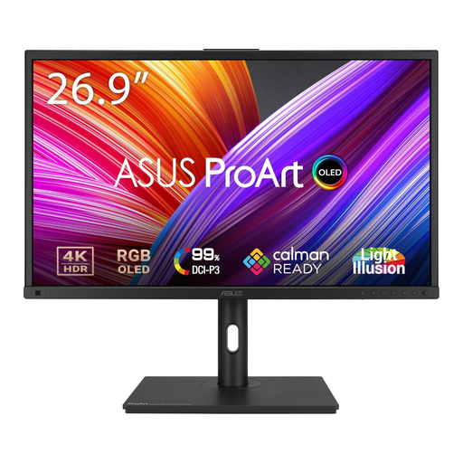 No image available
Consider this option when fine-type review sits alongside colour-focused creative work. Check its typical brightness for your daytime setup, and follow the guidance on prolonged high-brightness static images to reduce OLED burn-in risk.
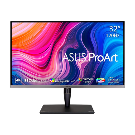 No image available
This larger-screen IPS Mini LED option may suit a creative desk where you can position the panel away from window reflections. Its 32-inch size changes the comparison with 27-inch 4K monitors; confirm the brightness figure and the conditions it describes rather than relying on a peak rating.
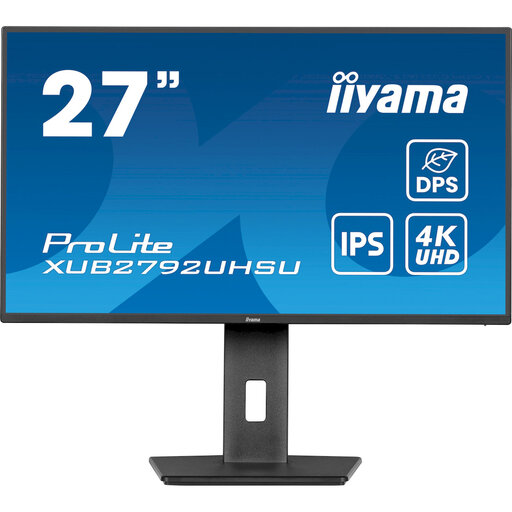 No image available
The 27-inch 4K format is relevant to close text and layout review. If window reflections or one-cable laptop charging matter to you, confirm the screen-surface treatment and USB-C power-delivery capability for this exact model.
 No image available
This is a 27-inch 4K choice for reviewing detailed layouts, with HDMI and DisplayPort connections. Check its screen-surface treatment for your window position; its DisplayHDR 400 designation does not establish readability in direct sunlight.
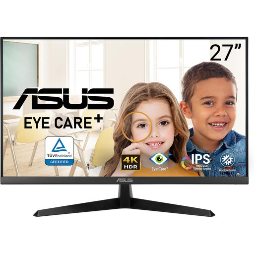 No image available
The 4K resolution makes this a type-review option if its position works in your room. Confirm the screen-surface treatment for bright-window use, and check whether tilt adjustment gives you enough freedom to avoid reflections.
No. A brightness rating indicates adjustment headroom, not whether reflected daylight will obscure type. Check for a matt or anti-glare surface and position the screen so direct sun and window reflections stay out of your viewing path.
Choose 4K when inspecting small letterforms and spacing closely is the priority: 3840 × 2160 provides more pixels than 2560 × 1440 at the same 27-inch size. QHD may suit you if its interface scale or a particular colour-management model matters more; try your preferred text size and scaling before deciding.
Not for every typography task. It becomes relevant when type is reviewed within a controlled print, prepress or brand-colour workflow. Check the exact monitor’s calibration support and whether the sensor and software your workflow needs are available.
Keep an old monitor out of general household waste. GOV.UK says waste electrical products can be taken to a local household waste recycling centre; you can also check whether reuse or retailer take-back is available to you.