For typography previewing, a 27-inch 4K monitor is a useful starting point if your computer can drive it at its native resolution. Consider a compatible 27-inch 5K Mac setup when finer pixel pitch is your priority; if you also review colour-managed layouts, check the exact display’s colour specifications and your software workflow before choosing.
Who needs this kind of monitor?
Type and interface reviewers
If you inspect font weights, spacing, labels or long passages at close range, make legible text at your intended working scale the priority. Microsoft Support notes that text looks less sharp when a monitor runs below its native resolution.
Colour-managed editorial designers
If type sits alongside logos, illustrations or page layouts, check colour specifications as well as text clarity. BenQ UK lists colour-coverage and calibration claims for specific designer monitors, but those claims do not replace colour management in your applications.
Mac-centred high-density users
If you work mainly from a compatible Mac and want a fine-pitch external display, examine both the panel and its connection requirements. LG UK lists a 5K Thunderbolt 3 display in its UltraFine range; confirm your exact Mac model, cable and available display mode.
What matters when choosing?
For typography previewing, establish a usable native-resolution setup first, then decide whether colour-managed work or desk connectivity changes which monitor suits you.
| Concern | What to check | Who this matters to |
|---|
| Text clarity at your working scale |
Compare screen size, native resolution and listed pixel pitch; confirm the computer can output the native mode. |
If I inspect letterforms and small interface text closely, I want legible type without relying on a lower-than-native resolution. Around 42% of consumers put text clarity first. |
| Colour alongside type |
Check the exact model’s stated colour coverage and calibration features, and whether your applications use colour management. |
When I review type within branded artwork or layouts, the surrounding colours matter to my decision too. Roughly 33% of consumers prioritise this colour-managed work. |
| Connection and desk workflow |
Confirm the computer, port and cable support the intended display mode; check stand adjustments and charging needs. |
For a laptop desk or frequently adjusted setup, I need the display connection and physical arrangement to work reliably. About 25% of consumers place workflow compatibility first. |
Mistakes to avoid
-
Judging sharpness by screen size alone
A larger screen does not necessarily show finer type. LG UK lists a 0.11685 mm pixel pitch for its 27-inch 5K 27MD5KL, while Dell UK lists 0.15540 mm for the 27-inch 4K U2725QE.
Compare size and native resolution together, and check listed pixel pitch for the exact models you are considering.
-
Lowering resolution just to enlarge text
Microsoft Support says text will not look as sharp when a monitor runs below its native resolution.
Confirm the computer is delivering the panel’s native mode, then try the operating system’s text-size or display-scaling controls for a more comfortable interface.
-
Buying colour features without a colour-managed task
Colour coverage and factory-calibration claims do not, by themselves, establish how a file will appear in every application or match a printed result.
If you review visual assets alongside type, check the exact monitor’s specifications and your application settings. For text-only work, give priority to resolution, a usable scale and the connection you need.
Relevant brands to consider
Dell
Dell’s UltraSharp U2725QE is a 27-inch 4K IPS Black reference point for typography work that also needs stand adjustment and laptop-oriented connectivity.
- Dell UK lists height adjustment, pivot and up to 140 W power delivery for the U2725QE.
- Its listed 0.15540 mm pixel pitch is less fine than the 0.11685 mm listed by LG UK for the 27-inch 5K 27MD5KL.
BenQ
BenQ’s PD2706U is relevant when typography is reviewed alongside colour-managed creative work.
- BenQ UK states 100% sRGB, 100% Rec.709 and 95% P3 coverage, alongside a Delta E ≤ 3 claim, for the PD2706U.
- These model-specific manufacturer claims do not ensure matching results across applications or printed output.
LG
LG’s UltraFine 27MD5KL is a 27-inch 5K option for a compatible Mac and Thunderbolt workflow.
- LG UK specifies a 5120 × 2880 IPS panel, 0.11685 mm pixel pitch and 94 W power delivery for the 27MD5KL.
- Check the exact Mac model, cable and supported output mode; a USB-C connection alone does not establish 5K compatibility.
Joybuy monitors for typography previewing
These 4K monitors offer different panel, connection and adjustment choices for previewing type. Check each model against your computer and working scale rather than treating resolution alone as a complete answer.
 No image available
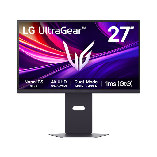
LG UltraGear G8 27G850A 27-inch 4K Nano IPS monitor
Consider this 27-inch 4K model if you preview type and also want the gaming modes named in its title.
Its title lists a Nano IPS panel, dual-mode 240Hz/480Hz operation, DisplayPort 2.1 and HDMI 2.1. Confirm which resolution is available in your intended mode, and whether your computer and cable support it.
Joybuy
 No image available
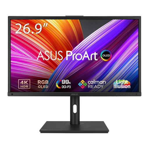
ASUS ProArt PA27DCE-K 4K UHD OLED monitor
Consider this model if an OLED display fits the way you review typography and visual layouts.
The title specifies 4K UHD and OLED. If your work keeps static content on screen for long periods, read the product’s OLED care guidance, and confirm native-mode support with your computer and cable.
Joybuy
 No image available
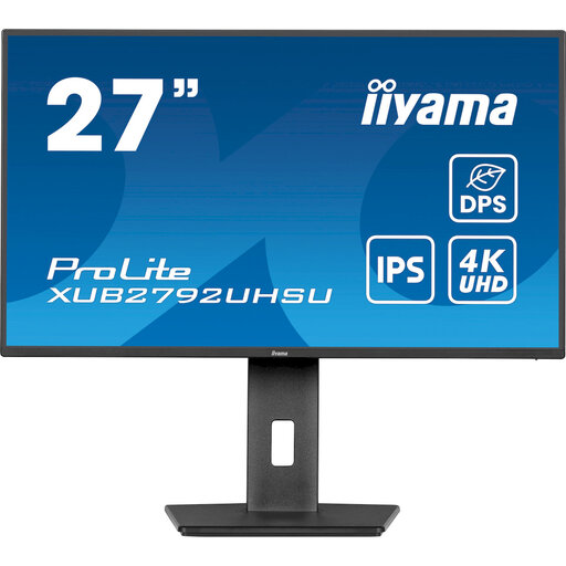
iiyama ProLite XUB2792UHSU-B6 27-inch 4K UHD monitor
This 27-inch 4K model is worth checking for a desk used to inspect text and page layouts.
Confirm that your computer and cable can deliver its native 4K mode. If you are comparing fine-pitch displays, check the exact model’s pixel pitch as well.
Joybuy
 No image available
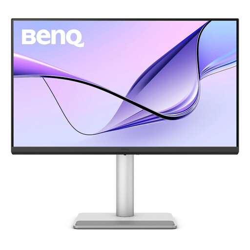
BenQ MA270UP 27-inch 4K Nano Glossy IPS USB-C monitor
Consider this model for typography alongside visual work if its glossy screen suits your desk lighting.
The title lists a 27-inch 4K Nano Glossy IPS display, USB-C and a height-adjustable stand. Check reflections where you will use it, plus your computer’s support for the intended 4K mode.
Joybuy
 No image available
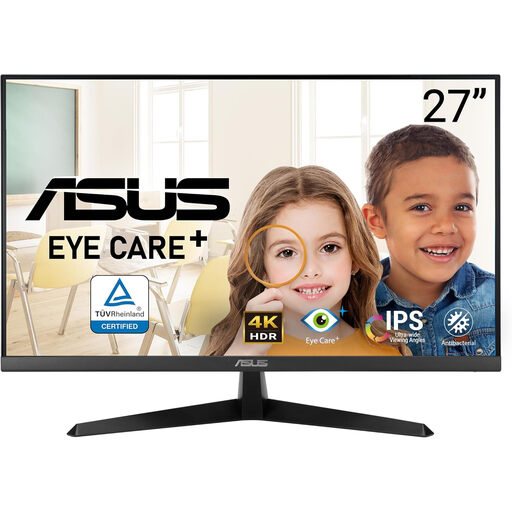
ASUS Eye Care VY27UQ 4K UHD 60Hz monitor
This 4K model is an option to examine for general typography previewing when its connections and stand suit your setup.
The title specifies a 60Hz refresh rate. Confirm native 4K output with your computer and cable, and check the exact stand adjustments and pixel pitch if those affect your choice.
Joybuy
Frequently asked questions
Should I lower the monitor’s resolution to make text larger?
Start at the monitor’s native resolution instead. Microsoft Support warns that text can look less sharp below native resolution; try your operating system’s text-size or scaling controls if the interface is too small.
How should I set up an external monitor for typography work on a Mac?
Start with a resolution supported by both your Mac and the connected display, then assess text size in Displays settings. Apple Support notes that scaled resolutions can affect performance, so check the available modes for your exact setup.
Do I need wide-gamut colour to preview typography?
Not solely to read or inspect text. If you also review type alongside brand colours, photography or print-oriented layouts, check the exact monitor’s gamut and calibration claims together with your applications’ colour-management settings; a wide-gamut label alone does not establish matching output.
What should I do with an old monitor?
Check an electrical-equipment collection or take-back route rather than putting the monitor in general rubbish. GOV.UK describes the UK’s waste electrical and electronic equipment rules as supporting recovery, reuse and recycling; ask your retailer or local authority which collection options apply.


