What matters when choosing?
Decide how the team will review web and UI colours before choosing extra creative-work features or a desk hub. Whichever monitor you choose, plan to test the actual content as well as the viewing setup.
| Concern | What to check | Who this matters to |
|---|
| sRGB-oriented review |
Look for a documented sRGB mode or coverage and model-specific calibration information. Check contrast in the actual interface. |
If I review web interfaces, I need a repeatable viewing condition without mistaking the screen for a contrast test; around 36% of consumers put colour-and-contrast review first. |
| Shared-device workflow |
Check each laptop’s video connection, charging needs, port layout and whether the required cable is included. |
When colleagues take turns at one desk, I need to connect my laptop and resume the intended viewing setup without a complicated handover; roughly 29% of consumers prioritise that workflow. |
| Creative-work crossover |
Match available colour-space modes and calibration documentation to the team’s files and applications. |
If the same display also serves colour-managed creative work, I need to know whether wider-gamut modes fit that work while keeping web review in its intended mode; around 21% of consumers place this crossover first. |
| Glare and adjustment |
Check the screen finish and stand adjustments against the desk position and lighting. |
At a desk used by different people, I need to reposition the screen and manage reflections comfortably; approximately 14% of consumers make workstation comfort their primary concern. |
Relevant brands to consider
These examples describe particular monitor lines, not every display from each brand. Match their documented features to the work and workstation before choosing.
BenQ
The PD2705U is a 27-inch 4K IPS option centred on sRGB and Rec.709 review at an adjustable shared desk.
- BenQ UK lists 99% sRGB and Rec.709 coverage, an average Delta E of no more than 3 and a factory calibration report for the PD2705U.
- Those model-specific colour claims do not establish that an interface meets WCAG requirements; test the content separately.
ASUS ProArt
The PA279CRV is a 27-inch 4K IPS option for teams whose interface review overlaps with colour-managed creative work.
- ASUS UK states that this model is factory pre-calibrated to Delta E below 2 and covers 99% of DCI-P3 and Adobe RGB.
- Wide-gamut coverage is not an accessibility criterion. Use the intended viewing mode for interface work and test content-level contrast and non-colour cues.
Dell UltraSharp
The U2725QE is a 27-inch 4K IPS Black option to consider where shared-desk connections and physical setup are prominent needs.
- Dell UK lists a Thunderbolt hub and an ambient-light sensor for the U2725QE.
- For colour-critical interface review, confirm the exact model’s available colour mode and calibration documentation before making it the team’s reference display.
Joybuy products for this task
These monitors offer different starting points for sRGB-oriented interface review, creative-work crossover and shared-desk use. Check each model’s viewing mode and workstation fit; none replaces testing the accessibility of the content.
 No image available
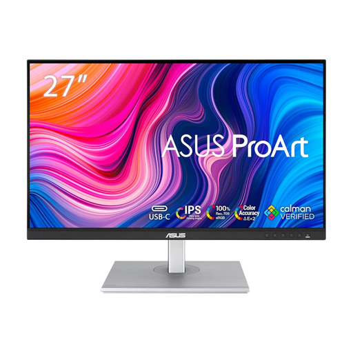
ASUS ProArt PA278CV IPS WQHD
Consider this model for an sRGB-oriented shared-desk workflow if WQHD resolution suits the workspace. Confirm the viewing mode and laptop connections needed by everyone who uses the desk.
Its stated WQHD resolution is 2560 × 1440, rather than 4K.
View on Joybuy
 No image available
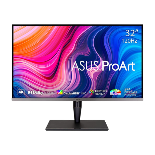
ASUS ProArt PA32UCG-K 32-inch 4K HDR IPS Mini LED
Consider the larger screen if interface review shares a desk with colour-managed creative work. Check how the team will switch to the intended viewing mode for web content and whether the screen fits the shared workspace.
The product title specifies a 32-inch 4K HDR model, rather than a 27-inch display. Confirm the exact panel description and calibration workflow for the unit before buying.
View on Joybuy
 No image available
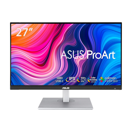
ASUS ProArt PA278CFRV IPS QHD 100Hz
Consider this QHD model for colour-oriented review at an adjustable shared desk, provided its resolution meets the team’s needs. Confirm the exact unit’s USB-C capability before planning a laptop handover around it.
The title specifies QHD resolution and a 100Hz refresh rate, not 4K resolution.
View on Joybuy
 No image available
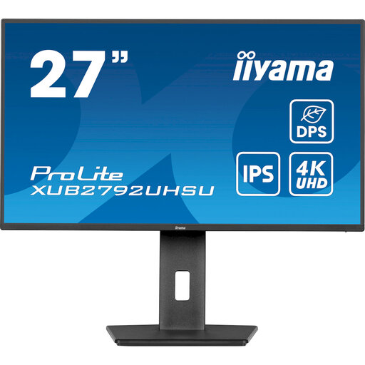
iiyama ProLite XUB2792UHSU-B6 27-inch 4K UHD
Consider this model if a 27-inch 4K workspace and shared-desk repositioning are priorities. For colour-critical review, confirm its calibration documentation; check the screen surface against the office lighting.
The product title specifies a 27-inch 4K UHD LED monitor. Its Matte Black colour description does not establish the screen-surface finish.
View on Joybuy
 No image available
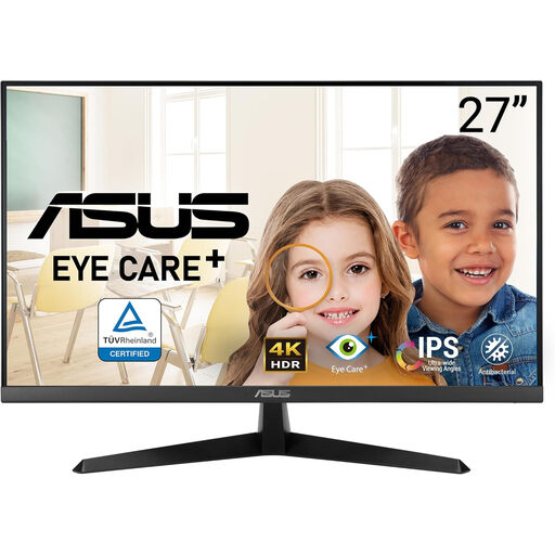
ASUS Eye Care VY27UQ 4K UHD 60Hz
Consider this 4K model if the desk setup does not depend on extensive stand adjustment. Before using it for colour-critical review, confirm its calibration documentation, screen finish and adjustment options.
The product title specifies 4K UHD resolution and a 60Hz refresh rate.
View on Joybuy
Frequently asked questions
Can a colour-accurate monitor prove that a page meets WCAG contrast requirements?
No. A monitor can provide a more consistent condition for visual review, but the W3C Web Accessibility Initiative’s WCAG 2.2 Success Criterion 1.4.3 concerns the content: it specifies at least 4.5:1 contrast for normal text and 3:1 for large text, subject to its definitions and exceptions. Check the actual foreground and background values and rendered interface.
Is passing a contrast check enough if colour identifies an error or status?
No. Under WCAG 2.2 Success Criterion 1.4.1, colour must not be the only visual means of conveying information or distinguishing an element. Check whether an appropriate label, icon, shape, pattern or other visual cue communicates the same meaning.
How should a shared office deal with glare and screen positioning?
Choose a screen and stand that can work with the desk, then assess the actual lighting and positions used by different people. Health and Safety Executive display-screen-equipment guidance covers adjusting screens and lighting to avoid reflections and glare; a monitor specification alone does not settle the workstation setup.
Does factory calibration remain accurate indefinitely?
No factory claim describes a display’s condition indefinitely. ASUS notes that display colour can change over time, particularly in wide-gamut workflows. For colour-critical decisions, arrange checks or profiling appropriate to the monitor, environment and work rather than relying solely on its out-of-box documentation.


