
24/7 Customer Support

Free returns

Same-day & Next-day Delivery

Quality Guaranteed

Unlock Your Welcome Offers: FREE Delivery | Up to 80% OFF | Free 30-day JoyPlus trial
Download the APP
The days of searingly bright, neon-yellow streaks dominating your textbooks and notes are fading. While traditional highlighters have their place, many students, journalers and office professionals are now seeking a softer alternative. Harsh fluorescent colours can cause eye strain during long study sessions and can feel visually jarring in a carefully curated planner. This is where pastel highlighters come in, offering a more subtle and organised way to make important information stand out.
This guide is designed to help you navigate the world of mild highlighters. We will explore the key features to consider before buying and present a few of our top recommendations to help you find the perfect set for your needs, whether for studying, creative projects or organising documents.
Finding the right highlighter goes beyond just picking a pretty colour. Functionality is key to ensuring your notes remain neat, legible and free from messy ink bleeds. Here are a few factors to consider.
The most common issue with any highlighter is the ink bleeding through the page, especially on thinner paper found in textbooks or Bibles. To avoid this, pay close attention to the ink type. Many no bleed highlighters use a water-based pigment ink. This type of ink sits on top of the paper fibres rather than soaking into them, significantly reducing the chance of it showing on the other side. It also tends to be more resistant to fading over time, keeping your notes clear for years to come.
The tip of the highlighter determines its function.
The term 'pastel' covers a wide range of soft, muted shades. When choosing a set, consider your primary use. For those using highlighters for studying, a varied palette allows for effective colour-coding of different topics or themes. For bullet journalers and creative individuals, a set of coordinated aesthetic highlighters can bring a cohesive and pleasing look to your layouts and designs.
Based on features that users value—such as ink quality, tip versatility and colour selection—here are some standout options available right now.
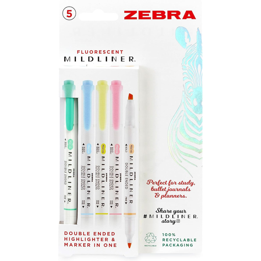
Why It Stands Out: This set offers a unique take on "fluorescent." The colours are brighter than typical pastels but are formulated to be much gentler on the eyes than traditional neon highlighters. They provide excellent contrast on the page without being overwhelming. The dual-tip design is a significant advantage, providing both a 4.0 mm chisel tip for broad strokes and a 1.4 mm fine bullet tip for detailed work.
Pros:
Who is it for: Students and professionals who need their highlighted text to be prominent but want to avoid the intensity of classic neon colours. It's a great middle-ground option.
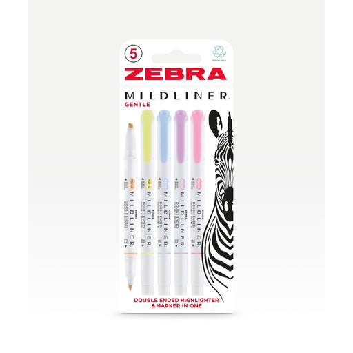
Why It Stands Out: This pack is the quintessential choice for those seeking true aesthetic highlighters. The "Gentle Colours" set includes a curated palette of soft, muted tones like Lilac and Soda Blue that are perfect for creating beautiful, organised notes and journal spreads. Like its fluorescent counterpart, it features the highly practical dual-tip design.
Pros:
Who is it for: Bullet journal enthusiasts, artists and anyone who prioritises a soft, coordinated aesthetic in their notes or planner.
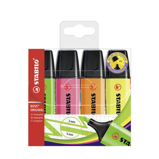
Why It Stands Out: The STABILO BOSS is an icon in the stationery world, known for its distinctive shape and reliability. This pastel version brings that trusted performance to a softer colour palette. Its most notable feature is the Anti-Dry-Out Technology, which allows the pen to be left uncapped for up to four hours without drying out—a lifesaver during intense study or work sessions.
Pros:
Who is it for: Users who value durability and reliability above all. It's ideal for heavy-duty highlighting tasks where you might frequently switch between reading and marking text.
Our recommendations cover some of the most popular choices, but the world of stationery is vast. If you're looking for different colour combinations, single pens or other types of journaling pens to complement your highlighters, there are many more styles to discover.
Explore our full collection of stationery pens to find the perfect tools for your desk. Browse All Stationery Pens
Yes, they are very effective. Many people find that the softer tones of pastel highlighters reduce visual fatigue, making it easier to study for longer periods. They also allow for more complex colour-coding systems without making the page look chaotic or overwhelming the text.
The best way to prevent bleed-through is to choose no bleed highlighters with water-based pigment ink. Additionally, the type of paper you use makes a big difference. Thicker paper (90 gsm or higher) is less prone to bleeding than standard, thin copy paper. It is always a good practice to test your highlighter on an inconspicuous spot first.
The terms are often used interchangeably, but there can be a subtle difference. 'Pastel' typically refers to a specific family of light, desaturated colours (like baby pink, light blue and mint green). 'Mild' is a broader term, popularised by brands like Zebra, to describe any ink that is less intense than traditional neon. This can include pastels, but also other soft, earthy or muted shades that are not strictly pastel.