What matters when choosing?
Choose the screen format around the windows you actually keep open, then plan checkout tests at defined browser viewport widths. A wider panel gives tools more room; it does not make a maximised browser representative of other devices.
34-inch 21:9 WQHD
Choose it when: Your main task is viewing a desktop checkout beside DevTools and another work window. LG UK lists its 34U640B-B at 3440×1440 in this format.
Trade-off: A 3440×1440 screen has fewer vertical pixels than a 5120×2160 model, so consider how much detailed material you need visible at once.
40-inch 5K2K
Choose it when: Detailed visual review and several dense desktop windows are routine. Dell UK and LG UK list 5120×2160 models in this size range.
Trade-off: Allow for the larger screen at your desk and confirm that your computer, input and cable support the display mode you intend to use.
49-inch 32:9
Choose it when: You need two broad desktop work areas at once. Samsung UK describes its Odyssey G91F as equivalent to two side-by-side 16:9 screens.
Trade-off: Its width is useful for parallel tools, but a maximised checkout browser is not a substitute for testing planned customer viewport widths.
| Concern |
What to check |
Who this matters to |
| Responsive testing |
Make room for DevTools while resizing the browser to your planned CSS viewport widths; include device emulation in the test workflow. |
I need to catch checkout layout problems at the widths customers use, not just see a page across my whole screen. Around 46% of consumers put viewport fidelity first. |
| Desktop workspace |
Compare a 21:9 layout with 32:9 according to how many broad windows must remain visible; consider vertical resolution for detailed review. |
When I inspect a checkout flow, I want the browser, debugging output and supporting material visible without constant window switching. Around 36% of consumers prioritise that desktop workspace. |
| Docking and positioning |
Check the exact monitor’s video connection, laptop charging capability and stand movement against your computer and desk. |
I use a laptop at my desk regularly, so a workable connection and screen position matter throughout the day. Around 18% of consumers place docking and workstation comfort first. |
Relevant brands for reference
These model examples illustrate different checkout-testing setups; each brand’s features depend on the particular monitor.
Dell
The UltraSharp U4025QW represents the high-resolution, docked-laptop route for detailed desktop review.
- Dell UK lists 5120×2160 at 120Hz, USB-C video and data, power delivery up to 90W, and height, tilt and swivel adjustment for the U4025QW.
- Check desk fit and whether the computer and cable can drive the display mode you intend to use.
LG
LG UK lists examples in both the 34-inch desktop-workspace route and the larger 5K2K route.
- The 34U640B-B is a 21:9, 3440×1440 model with USB-C power delivery up to 65W; the 40WP95CP-W is a 5120×2160 model with Thunderbolt 4.
- The two models make different demands on desk space and connectivity; check the exact model against your laptop and work area.
Samsung
The Odyssey G91F illustrates a 49-inch 32:9 setup for deliberately split desktop work.
- Samsung UK describes the G91F as equivalent to two side-by-side 16:9 screens and lists Picture-by-Picture and Picture-in-Picture functions.
- Keep checkout browser windows at planned test widths rather than using the entire panel as the test viewport.
Joybuy monitors for these workflows
These models cover 34-inch ultrawide desktop setups and a 49-inch option for broader parallel work. Choose by the windows you need beside the checkout page, then check each monitor’s connection and desk requirements.
 No image available
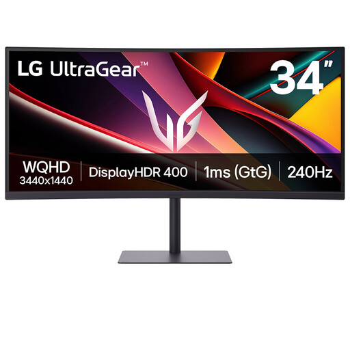
LG UltraGear 34G630A-B 34-inch VA WQHD monitor
Consider this 34-inch ultrawide for a checkout window beside testing tools, rather than as a replacement for responsive browser checks.
The product name specifies a VA panel, WQHD resolution and a 240Hz refresh rate. If laptop docking matters, confirm the video mode, cable and charging capability against your laptop before buying.
Joybuy
 No image available
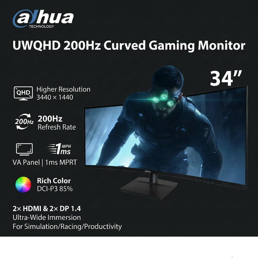
Dahua 34-inch curved UWQHD monitor, 200Hz
The 34-inch ultrawide format is relevant if you want a desktop checkout page and supporting tools in separate windows.
The product name specifies 3440×1440 resolution, a VA panel, two HDMI inputs and two DisplayPort 1.4 inputs. Confirm that your computer and cable support the display mode you plan to use.
Joybuy
 No image available
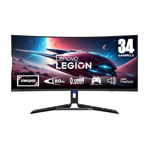
Lenovo R34w-30 34-inch UWQHD monitor
This 34-inch ultrawide is worth considering when the checkout browser needs to sit beside a test plan or development tools.
The product name specifies UWQHD resolution. Check the available video-input modes and your computer and cable compatibility for the setup you intend to use.
Joybuy
 No image available
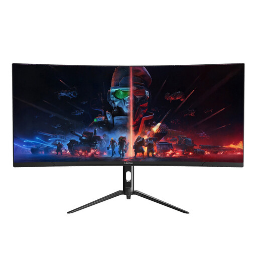
Lepow HC-SJ34MZ5 34-inch curved monitor
Its 34-inch ultrawide format suits a desktop checkout window beside supporting work, provided you set the browser to your intended test widths.
The product name specifies 3440×1440 resolution and a 165Hz refresh rate. Check the input modes, cable compatibility and stand movement if those affect your desk setup.
Joybuy
 No image available
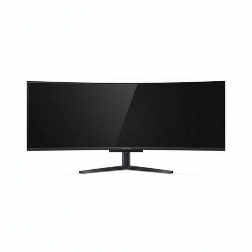
Acer X Predator X49X 49-inch QD-OLED monitor
Consider this wider format if you deliberately keep several broad desktop windows visible, with the checkout browser constrained to planned viewport widths.
The product name specifies a 32:9 QD-OLED curved display, Double Quad HD resolution, HDMI, DisplayPort and USB-C. Check its physical footprint and whether your computer and cable support your intended display mode.
Joybuy
Frequently asked questions
Can an ultrawide monitor replace mobile checkout testing?
No. It can keep the checkout page and tools visible, but it does not reproduce a mobile device merely by changing the screen size. Web.dev explains responsive layout in terms of viewport width, while MDN Web Docs distinguishes CSS pixels from physical pixels; test defined viewports and relevant device behaviour separately.
Which resolution should I choose for checkout QA?
Choose by the work you need visible: a 3440×1440, 21:9 screen suits a browser beside tools; a 5120×2160 screen provides more pixels for dense visual work if your computer supports it; and a 5120×1440, 32:9 layout suits unusually broad parallel work. Dell UK, LG UK and Samsung UK list examples of these formats. None removes the need to set deliberate browser test widths.
What should I check before connecting a laptop by USB-C or Thunderbolt?
Check the exact monitor’s video and power-delivery capabilities alongside your laptop port, cable and intended display mode. Charging and connection features vary by model: Dell UK lists up to 90W power delivery for the U4025QW, while LG UK lists up to 65W for the 34U640B-B.
When does a UK workplace need a display-screen assessment?
The Health and Safety Executive says employers must assess workstations for workers who use display screen equipment daily as part of normal work, continuously for an hour or more. The assessment concerns the workstation and work being done; it does not prescribe a particular ultrawide size.


